Shor
Shor
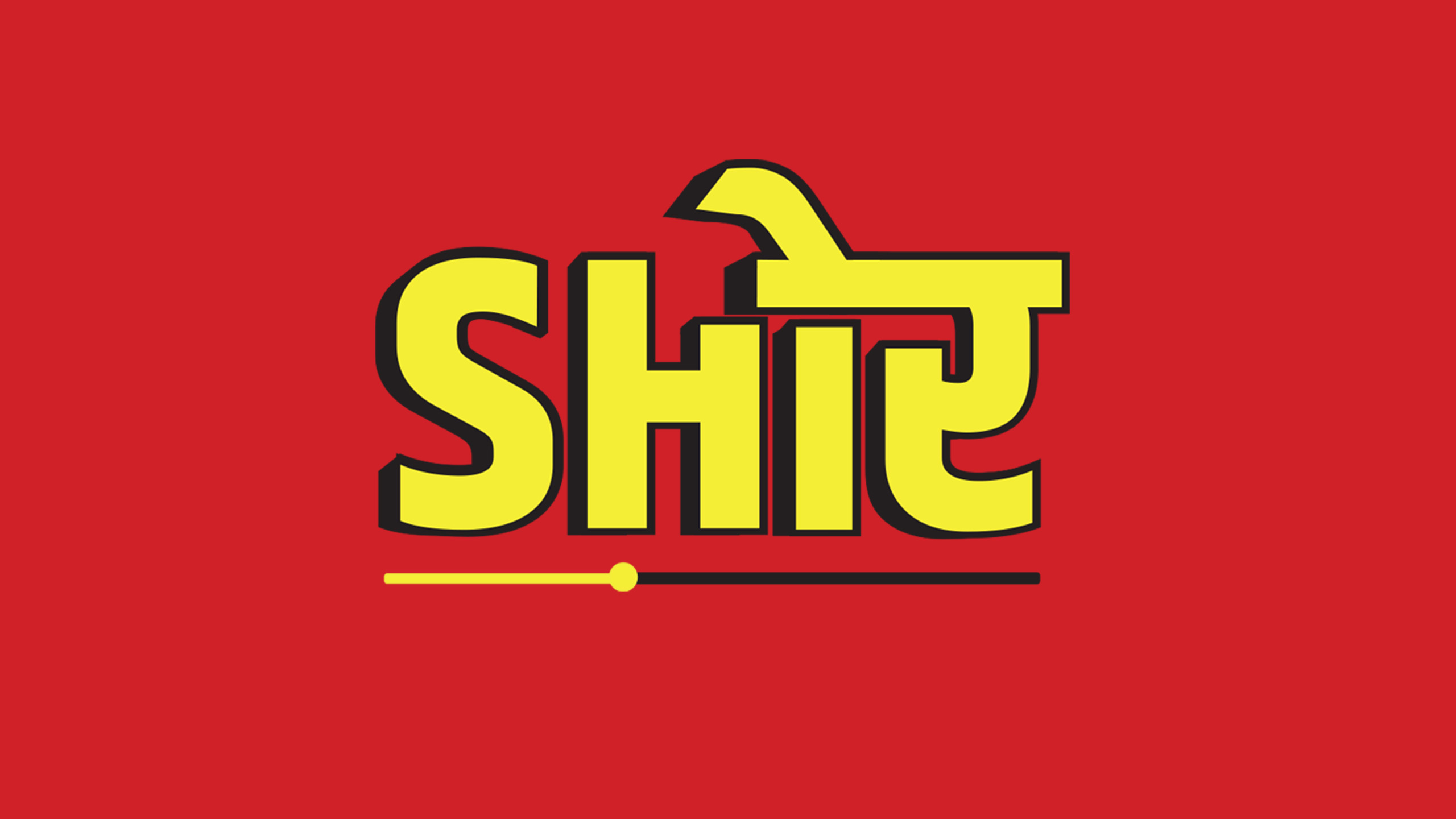
Brand Logo and Tagline
July 31, 2026
Toki Studio
Brand overview
SHOR, that literally translates to “Noise” in Hindi, is born from the love of movement, sometimes steady, sometimes slow.
Shor is more than just a platform, it’s emotion driven community. A community that loves to move, evolve, and express itself. Sometimes it drifts, sometimes it explores, but it always crawls back to reconnect with its true movement, it’s inner SHOR.
The fusion of English “SH” and Hindi “OR” reflects how deep Indian roots have the potiential to take over global trends and interactions. It’s a space where cultures blend and yet they feel like ONE.
At its heart, Shor is about finding real people, building real bonds, and celebrating a shared love for movement, all while keeping that playful inner child alive, even amidst the world’s endless shor.
- Brand Logo and Tagline
- Brand Icons
- Brand Colours
- Brand vision and Identity
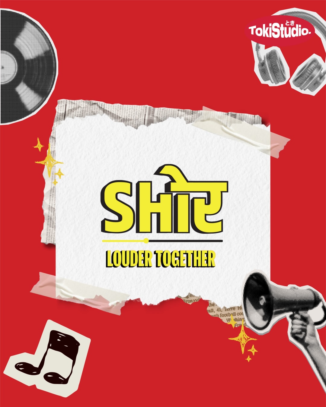


A complete brand logo and tagline story shaped
for clarity, consistency, and measurable
brand momentum.
01. Challenge
Creating a brand identity for Shor meant building something fun, free, and deeply relatable to the Dance and Music community. Shor is a shared space where artists, studios, performers, and dance enthusiasts can connect, discover classes and workshops, and stay updated with everything happening within the community. These sessions are often led by recognised dancers, artists, and dance groups from across the industry. The identity needed to feel energetic yet calming, playful yet rooted. The fusion of the English “SH” and the Hindi “OR” represents the way Indian culture can move beyond borders and influence global trends and conversations. It is a space where different styles, languages, and cultures come together, blend naturally, and still feel like one.02. Solution
Create a flexible system across identity, content, and rollout so the brand can show up consistently.03. Results
Build a sharper presence with reusable assets, stronger recall, and a clearer path for future campaigns.
Interested in working with us?
We build brands, run social media and design the work that carries them — from Delhi, for anyone.